Asianati
Asianati is a Greater Cincinnati-based Asian directory that primarily features a local Asian food directory and community stories, with recent integrations of social media feeds and event calendars.
My team completed a holistic UX research review of the company. The research included a heuristic evaluation, interviews, comparative analysis, usability tests, and then presented the overall findings into concrete design recommendations.

Problem & Audience
Problem
Finding places and events on Asianati is harder than it should be. In interviews and a quick heuristic review, people said the food finder felt confusing, and they lacked trust signals (ratings/reviews) when choosing.
That slows down discovery and undermines Asianati’s value as a curated guide.
Goal: This project explores how to make navigation obvious and decisions confident, without losing the editorial voice that makes Asianati unique.
Audience
Primary: Local diners and visitors looking for where to eat now or what’s happening this week. They scan fast, compare options, and want 1–2 clear trust cues (reviews, recs).
Secondary: Community members following stories/culture and small business owners checking how they’re represented.
Context constraints: Mobile-first usage, in-the-moment decisions, limited patience for unlabeled icons or deep menus.

Research
To understand how people actually find places and events on Asianati we ran a suite of UX research methods: user interviews, a heuristic evaluation of the current experience, a comparative analysis of adjacent products, and a usability analysis of key flows.
The goal was to turn evidence into design requirements that improve wayfinding and decision confidence while preserving Asianati’s curated voice.
Study snapshot
Audience: local diners/visitors; mobile-first behavior
Participants: n=5 (30–45 min remote interviews; mix of new/returning users)
Timeline / role: 8 weeks · researcher + designer
Heuristic evaluation: Nielsen’s 10; ~25 issues (visibility of status, icons)
Comparative analysis: 3–4 regional/adjacent guides (filters, reviews, events)
Usability analysis: think-aloud on core tasks (find a place, apply a filter, etc)
Recruiting: community outreach + personal network + client contacts

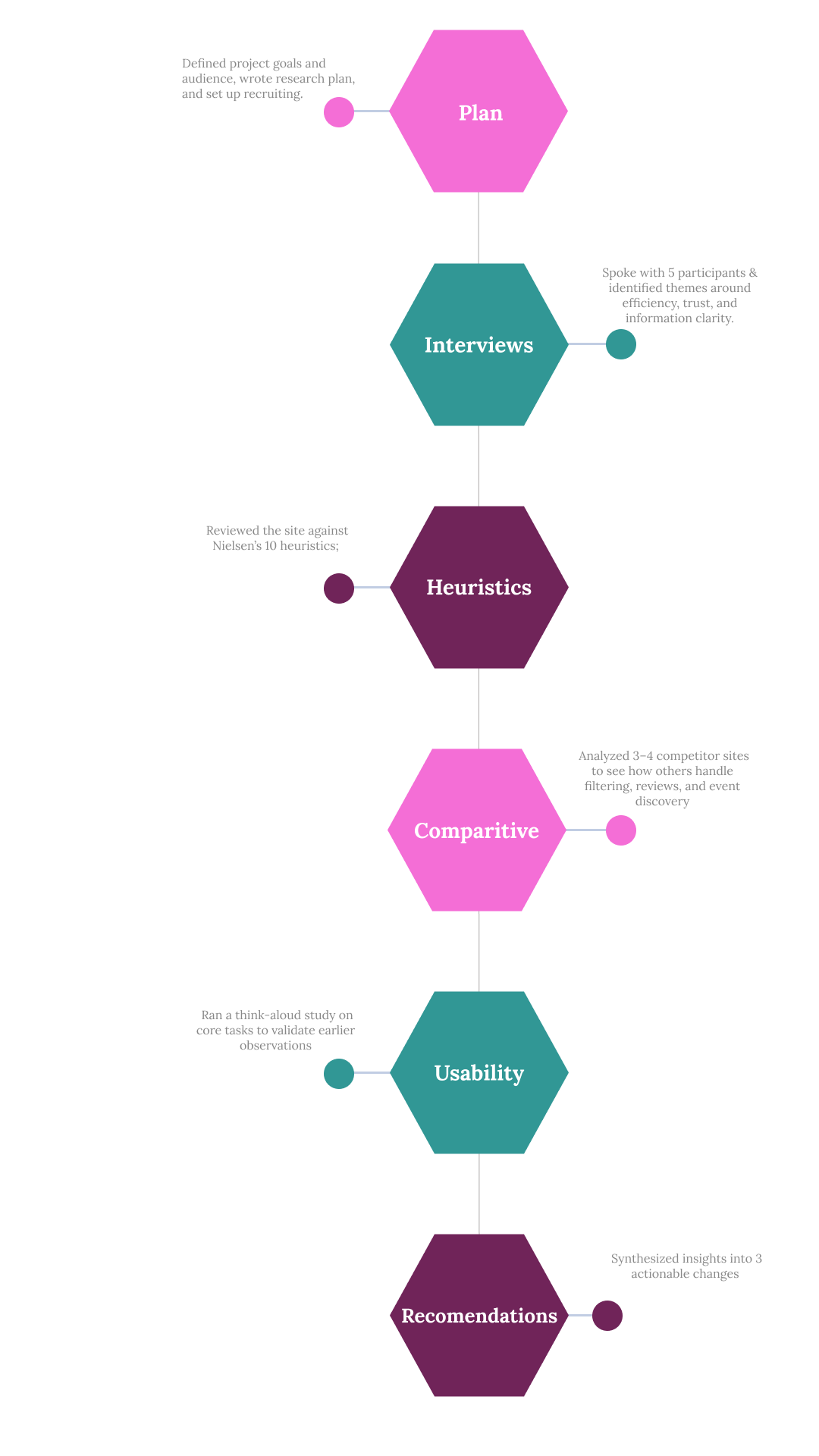
Timeline
User Interviews
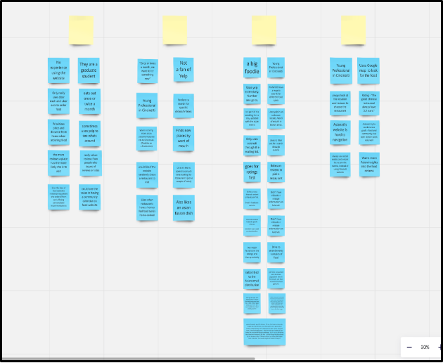
We spoke with five participants about how they find places and decide where to go. I broke the transcripts into quotes/notes and grouped them into three recurring themes.
Who we spoke to (at a glance). Five participants (ages ~20–39), mostly in Greater Cincinnati (one out-of-area), all with varying familiarity with Asianati and typical restaurant-finding tools (Google, Yelp, word-of-mouth).
What we heard (themes)
Efficiency. People scan quickly on mobile; icon-only controls and extra taps slowed them down getting to a useful list.
Trust signals. Editorial curation is appreciated, but most still wanted stars and review counts to decide without leaving the site.
Representation & IA clarity. Users like that Asianati spans food and community, but the split and entry points weren’t obvious.

Affinity Map Themes
01
02
03
Efficiency is Key
Users don’t want to spend too much time searching through events or restaurants
Ratings and Reviews
Users are more likely to look at a restaurant with reviews
Improve Information Architecture
Users need clearer information architecture between food and community content.
Heuristic Evaluation
We conducted a heuristic evaluation of Asianati’s current site using Nielsen’s 10 usability heuristics. This helped us spot avoidable friction without bringing users into the loop. Our review surfaced ≈25 issues, with the most frequent violations falling under:
Visibility of system status – users aren’t given clear feedback on what’s clickable or where they are.
Match between system and the real world – icons, terms, and patterns don’t consistently align with how people think about finding food or events.
Consistency and standards – icons, fonts, and interaction patterns vary across pages.


Comparative Analysis
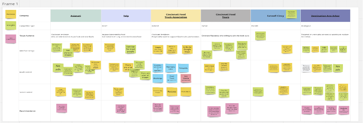
To understand where Asianati stands relative to other food and event platforms, we conducted a comparative analysis. We reviewed four competitors, Yelp, Cincy Food Tours, EatWell Cincy, and Destination Ann Arbor, focusing on how each handled filters, reviews, curation, and events integration

01
More Curated Content
Asianati excels at content that feels curated. They should lean into creating more curation to differ from its competitors.
02
Restructuring of existing content
Users find the current structure of the website to be slightly confusing. The balance between food and cultural information.
03
Filling in the Gaps
Asianati competitors make sure pages are consistent. Therefore consistent price/menu and external links should be available.
Usability Analysis
To check whether our early recommendations held up in practice, we ran a moderated think-aloud (n=5, mobile-first) on the core journeys. Sessions focused on finding, filtering, deciding, and checking details directly addressing friction surfaced in interviews, heuristics, and the comparative scan.
Tasks we tested
Find a place using the Food Finder from Home
Apply a filter and compare two options (e.g., cuisine / open now)
Check an event via Calendar
Confirm pricing/menu info on a restaurant listing
Findings
We synthesized interviews (n=5), a heuristic review (~25 issues), a four-product comparative scan, and a quick usability pass on core flows. Three findings consistently showed up; each maps to a concrete requirement and a focused design response.
1) People scan fast; unlabeled or hidden controls slow decisions
Evidence
Interviews: Icon-only controls and extra taps made it harder to reach a useful list.
Comparative: Competitors expose labeled filters (“Open now”, price, cuisine) clearly.
Usability: Misclicks and backtracks on finder controls; users missed filters.
2) Choice confidence hinges on quick social proof
Evidence
Interviews: People appreciated curation, but still wanted stars + review counts to commit without leaving.
Comparative: Competitors surface ratings and counts on cards and detail.
Usability: Participants opened external tabs for reviews; decisions slowed.
Requirement
Users are more likely to view a listing when lightweight reviews are visible.
3) Food vs. community content isn’t clearly separated
Evidence
Interviews: People liked both “food” and “community,” but entry points weren’t obvious; Calendar was clear, other handoffs weren’t.
Comparative: Clearer sectioning on peers (events vs. places vs. stories).
Usability: Users hesitated at Home deciding “where to start.”
→
→
→
Requirement
Users need labeled, obvious ways to start and fewer steps to results.
→
→
Requirement
Users need clearer information architecture to distinguish food from community content.
→
Design Response
Replace icon-only finder chips with text labels; consolidate to one “Start here” entry on Home.
Use a single filter panel with plain-language categories; keep applied chips visible.
Design Response
Add stars + counts to list & detail; maintain editor picks prominence.
Standardize price/hour/menu blocks; reduce off-site hops.
Design response
Keep the familiar Calendar model; add a clear Food entry on Home.
Rename/flatten labels that don’t match user phrasing; unify nav states
What I Learned & Next Steps
Working on Asianati sharpened my ability to translate mixed research inputs into clear, testable requirements. Interviews, a heuristic review, a comparative scan, and a small usability pass kept pointing to the same trio: make finding obvious and fast (labels > icons), add lightweight social proof (stars + counts), and clarify the IA (explicit entry points for Food vs. Community/Events). Turning those into concrete success signals (like reaching a list in 2 taps) made the design choices feel inevitable.
I also learned to prioritize clarity over cleverness. Icon-only controls felt elegant in Figma, but real users guessed, mis-clicked, and backtracked. Labeled chips, visible filter states, and consistent card facts performed better, even if it meant trading a touch of minimalism for speed and confidence. And importantly, curation and social proof can coexist: keeping editor picks while surfacing stars + counts let users decide faster without sending them off-site
If we had more time:
Phase 1: Ship the low-lift fixes
Label the Food Finder (replace icon-only chips)
Surface social proof (stars + review count on cards/detail).
Normalize listing facts (consistent price range, hours, and clearly labeled external menu links).
Instrument analytics (events for taps to list & link clicks).
Phase 2: IA & polish
Clarify entry points (separate Food and Community/Events paths on Home; unify active/selected states).
Copy audit to align labels with user vocabulary.
Design system pass (chip states, card anatomy, nav patterns).
Phase 3: Re-test & iterate
Moderated retest (n≈5–7) focused on: time-to-list, filter comprehension, first-click to section, and click through rate
A/B or staged release if traffic allows; compare against baselines.
Content ops: define a cadence for curated collections so editorial voice stays visible alongside reviews.