Gooey.AI Data Dashboard
Gooey.AI Impact Dashboard is a web-based tool designed to help nonprofits and social enterprises measure and communicate their impact using the Theory of Change framework.
I used a mixed methods approach, combining user log analysis, product metrics, interviews, usability testing, and visualization testing to create a clear and actionable dashboard for impact organizations.
My Role: UX Researcher (Mixed Methods)
Timeline: 14 weeks (team project)
Deliverables: User interviews, visualization testing, heuristic evaluation, usability testing, and behavioral data analysis

Problem, Audience, & Goal
Problem
Gooey.AI partners with organizations that use conversational AI to support social impact work in fields like education, agriculture, and public health. These organizations collect valuable data from chatbots but often struggle to connect those interactions to real-world outcomes.
Existing analytics tools emphasize technical performance metrics but offer little insight into why outcomes happen or how AI-driven interactions contribute to long-term goals.
Audience
Program managers, evaluation specialists, and funders who rely on chatbot data to make decisions and demonstrate impact.
Goal & Research Questions
Can we turn messy chatbot signals into clear, trustworthy, and actionable impact insights for program teams, analysts, and funders.


Mixed Methods Research Approach
Quantitative UX Research
I analyzed anonymized user logs and product metrics to understand how people were using Gooey.AI tools. I looked for usage patterns, engagement trends, feedback signals, and other data points that could help the team decide which dashboard metrics mattered most.
Data Sources
User logs
Product metrics
Feedback ratings
Written feedback
Timestamps
Qualitative UX Research
I interviewed stakeholders and domain experts to understand how impact organizations use data to make decisions. I also used affinity mapping, journey mapping, visualization testing, usability testing, and heuristic evaluation to identify where the dashboard was clear, confusing, or missing context.
Research Activities
User log analysis
Usage pattern analysis
Engagement trend review
Feedback signal analysis
Participants
Gooey.AI clients
Program managers
Monitoring and evaluation experts
Data visualization experts
Impact organization representatives
Research Activities
Stakeholder interviews
Domain expert interviews
Affinity mapping
Journey mapping
Visualization testing
Usability testing
Heuristic evaluation
Quantitative Findings
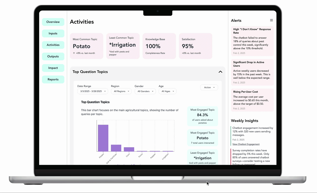
We analyzed 855 anonymized interaction records from 33 users to understand what kinds of activity the dashboard needed to make visible.
The logs showed that usage was not evenly distributed. A small group of users drove much of the activity, with the top five users accounting for about 54% of logged interactions. This made it important for the dashboard to show engagement patterns, not just total usage.
The logs showed:
855 anonymized interaction records
33 anonymized users
Usage was concentrated
with the top 5 users making up about 54% of logged interactions
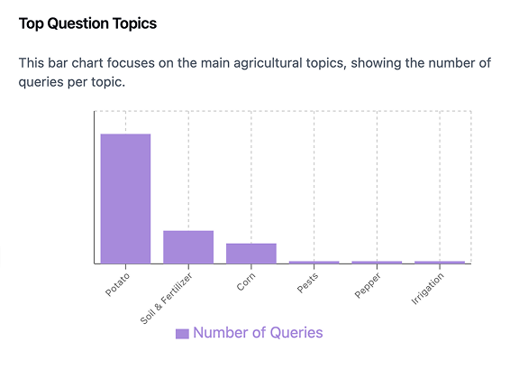
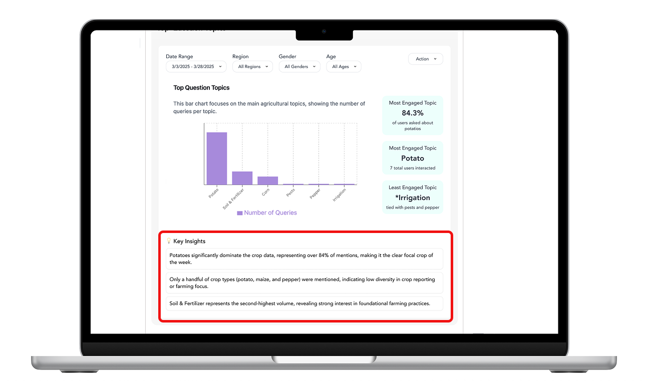
Approximately 45–55% of interactions clustered around practical agriculture topics like crop care, fertilizer, pests/disease, livestock, and yield/cost questions.
Approximately 70% appeared to be how-to or decision-support questions, meaning users were usually asking for practical guidance rather than exploring.
Some records had missing user message text
which suggests image based interactions, translation gaps, or incomplete logs
These patterns helped shape our qualitative research. They informed what we asked in interviews and what we tested in the dashboard, allowing us to focus on areas where users seemed most uncertain or where the data alone was not enough.
Qualitative Findings
To understand what the logs could not explain, we interviewed stakeholders and tested dashboard concepts with data visualization and impact measurement experts. These sessions helped us understand how teams interpret data, decide what matters, and communicate impact.
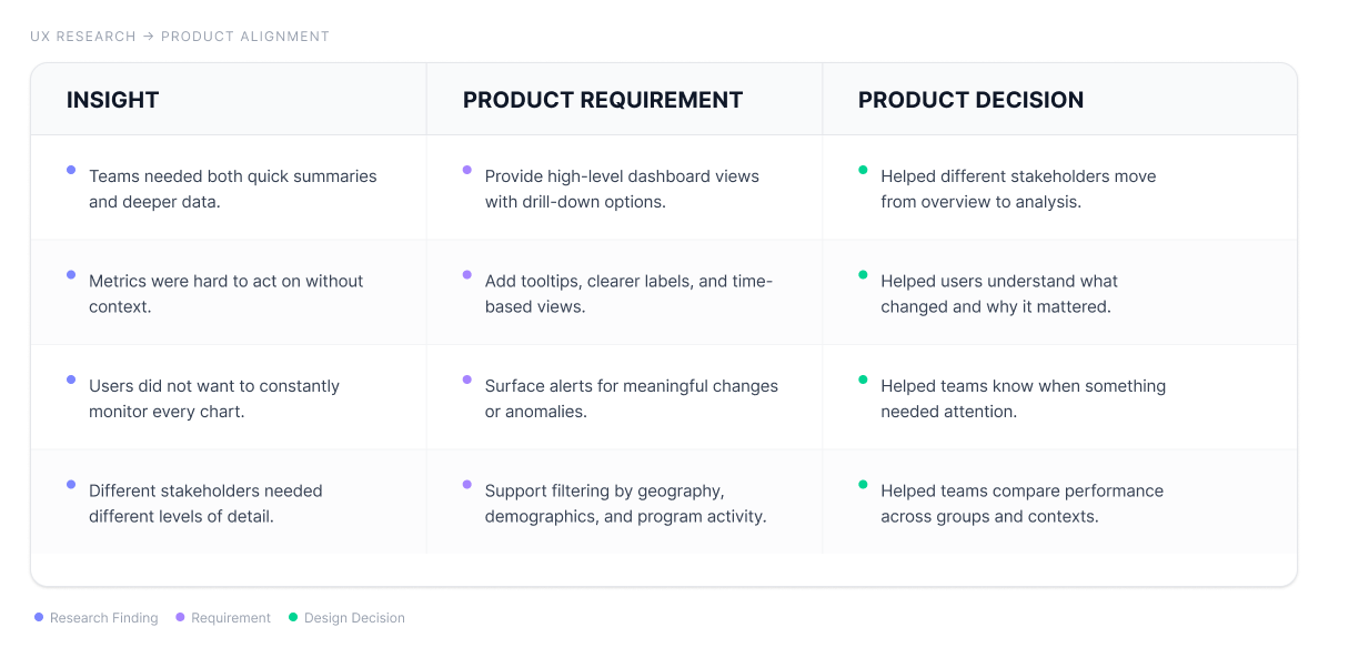
Finding 1: Teams need both overview and detail
Stakeholders did not all need the same level of information. Some users needed a quick summary of program performance, while others needed to drill into the data to understand what was driving the results.
This meant the dashboard could not work as a single static report. It needed to support both fast check-ins and deeper analysis.
High-level views helped users quickly understand whether a program was on track.
Drill-down views helped users investigate trends by activity, geography, or audience group.
Finding 2: Metrics need context to be actionable
Users needed more than numbers on a screen. They needed to understand what the metrics meant, why they changed, and how they connected to program goals.
This shaped how we thought about data visualization. Charts needed clear labels, definitions, time-based views, and supporting explanations so users could act on what they were seeing.
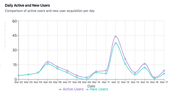
Time-based views helped users track change across a program instead of reading metrics in isolation.
Tooltips and clearer labels helped reduce confusion around unfamiliar terms and dashboard categories.
Finding 3: Trust depends on clarity, language, and review support
Stakeholders were cautious about AI-generated insights when the language felt too broad, subjective, or unsupported. They wanted the dashboard to explain what it was showing and give enough context to judge whether an insight was useful.
This meant trust was not just a visual design issue. It depended on clearer terminology, transparent explanations, and review support for unexpected changes.
AI insight callouts needed neutral language and comparative context.
Alerts were most useful when they pointed users toward what changed and where to look next.
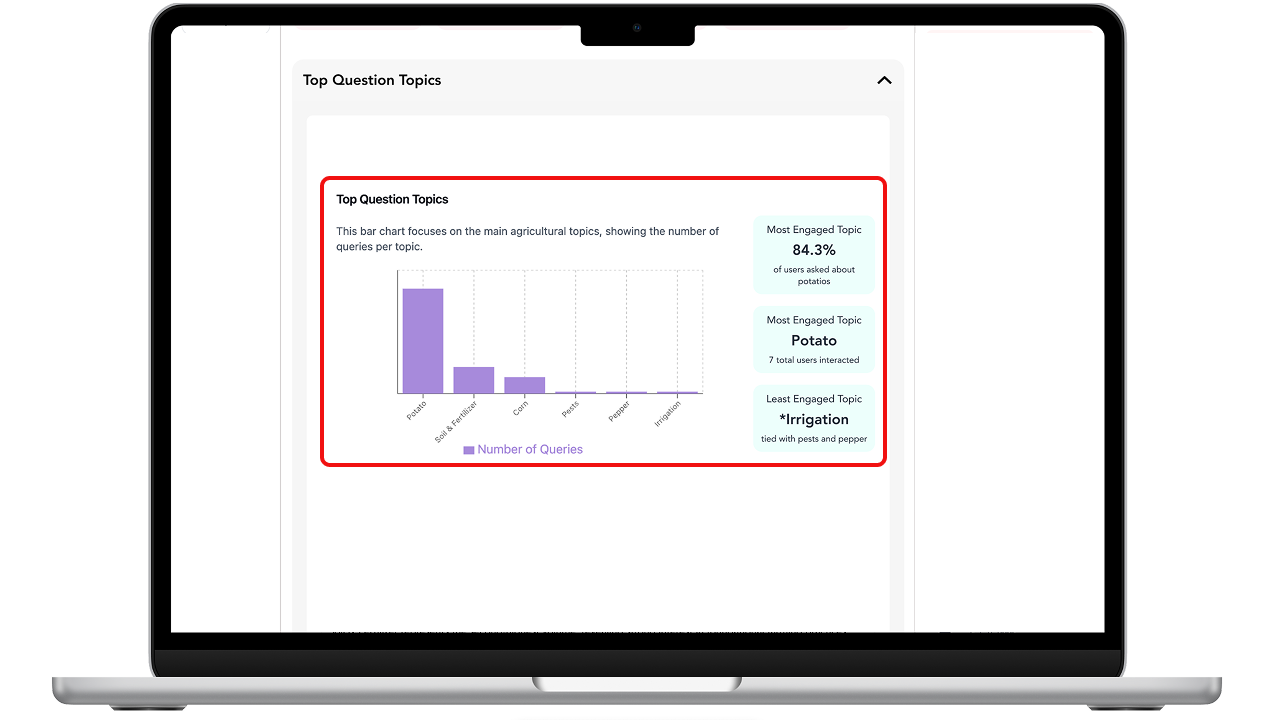
Shows high-level feedback and AI-generated drill-downs for relevant metrics.
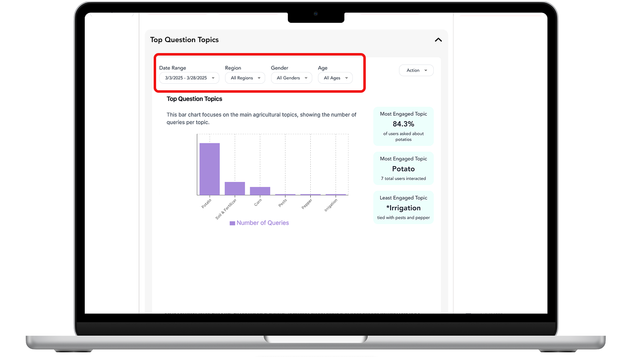
Shows time and demographic based options for tracking changes over time.
Shows natural-language AI insights that summarize key patterns.
Turning Research into Requirements
After synthesizing the log analysis, interviews, and testing feedback, we translated the strongest patterns into design requirements for the dashboard. We prioritized requirements that appeared across multiple research activities and directly supported decision-making.
Prioritization note
We used MoSCoW prioritization and dot voting to focus on requirements that were both high-value and feasible. The strongest priorities were multi-level views, clearer visualizations, interactive filtering, alerts, and stronger support for explaining impact.
Final Design Decisions
Theory of Change structure.
The dashboard was organized around Theory of Change stages so users could connect program inputs, user activity, outputs, and impact in one place..
Drill-down views
Instead of showing only top-level metrics, the dashboard let users move from summary views into more specific breakdowns by page, chart, or program area
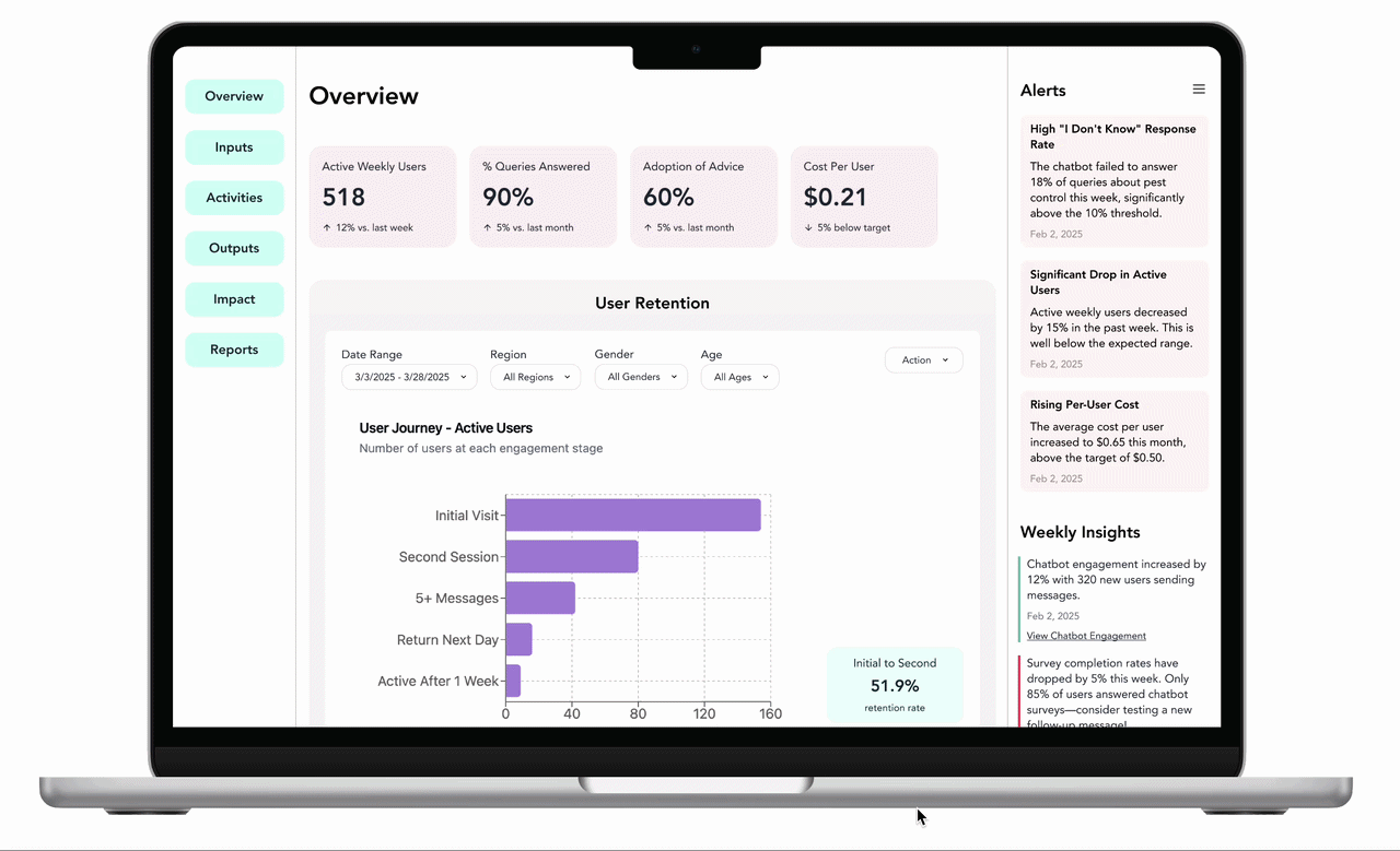
Filters for comparison
Filters helped users compare patterns by gender, region, and time period, making it easier to understand if outcomes differed across groups or contexts.
Alerts and insight callouts
Alerts and AI-generated insights surfaced important changes so users did not have to monitor every chart manually. This helped teams notice shifts, investigate causes, and decide where to focus next.
Recommendations and Next Steps
Based on the research, we recommended launching with the Overview and Inputs pages first. These pages gave teams the clearest starting point for tracking activity, understanding resources, and identifying where they needed to investigate further.
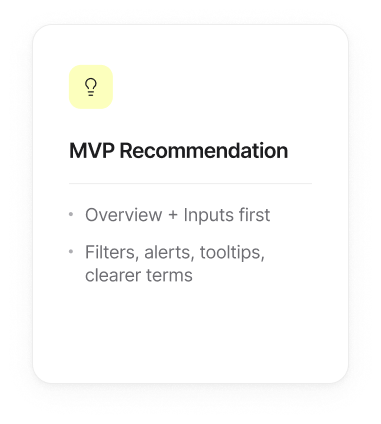
Prioritize filters, alerts, and tooltips because they directly support interpretation.
Improve terminology before launch so users understand labels consistently.
Keep the first release desktop-first, since dashboard analysis is more likely to happen during planning and review workflows.
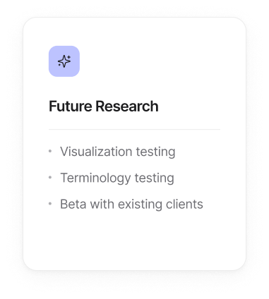
Test revised visualizations for charts that caused confusion.
Validate dashboard terms through card sorting or terminology testing with Gooey.AI clients.
Run a beta with existing clients to observe how teams use the dashboard in real program review meetings.
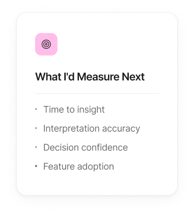
Time to insight: How quickly can users identify what changed?
Interpretation accuracy: Can users correctly explain what a metric means?
Decision confidence: Do users feel more confident using the dashboard to make program decisions?
Feature adoption: Which dashboard views, filters, and alerts are used most often?